Casino Floor Wayfinding Signage: How Navigate?
Casino floor wayfinding signage is not decoration—it is a psychological weapon and a crowd-control mechanism, and most operators get it catastrophically wrong. Walk into any poorly designed gaming floor and you will see the same disaster: guests circling the same bank of slots like lost tourists, blocking aisles, generating congestion that kills dwell time and spikes security incidents. The core failure is almost never the sign itself. It is the failure to understand that casino floor wayfinding signage must operate as a layered, hierarchical system that fights the deliberately disorienting architecture of the modern gaming floor.

The Hostile Geometry Problem
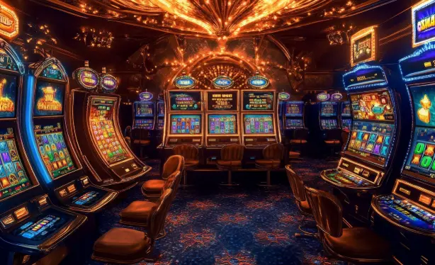
Here is the brutal truth nobody in the design department wants to hear: casino floors are engineered to disorient. Low ceilings, repeating carpet patterns, zero natural light, and a labyrinth of slot banks are all intentional. They trap guests in a state of pleasant confusion that maximizes time-on-device. 🎰 Wayfinding signage has to work against that entire environment. If your overhead directional signs rely on cardinal directions like "North" or "East," you have already lost. Guests do not think in compass points; they think in landmarks, anchors, and destinations. The signage must speak in the language of the floor: "Restrooms past the high-limit room," "Cashier behind the center bar," "Exit through the north parking bridge."
The single most effective tactic is anchor-based orientation. Every zone needs a massive, unmistakable visual landmark—a light feature, a signature bar, a sculpture—paired with consistent color coding. When a guest can say "I am near the red zone," your casino floor wayfinding signage has done its job. When they cannot, you are paying security staff to be human signposts all night.

Hierarchy: The Three-Tier Signage Stack
Amateur operators throw up one layer of signs and call it done. Professionals build a three-tier stack, and anything less is malpractice. Tier one is the macro layer: large overhead directional panels placed at major decision points and corridor junctions, readable from forty to sixty feet. Tier two is the meso layer: zone identification and amenity markers at eye level, confirming the guest is moving in the right direction. Tier three is the micro layer: restroom, ATM, and cashier markers at the point of need.
🎯 The critical error is redundancy collapse—putting every piece of information on every sign. That creates visual noise, and visual noise is functionally identical to no signage at all. Each tier must answer exactly one question. Where do I go next? Am I still on track? Where is the thing I need right now? Keep those questions separated and the floor becomes navigable without a single staff member intervening.
Lighting, Contrast, and the Readability Trap
Casino floors are a lighting nightmare. You have got dim ambient zones, blazing slot screens, and moving LED walls all competing for the guest's visual attention. 🔥 A sign that looks crisp on the design proof will vanish into the glare of a thousand machine displays. The non-negotiable rule: signage must maintain a minimum 4.5:1 contrast ratio against its actual mounted background, not the background you wish it had. Backlit panels with matte finishes beat glossy reflective surfaces every single time. Test every sign under real floor lighting before final fabrication—no exceptions, no excuses.
Font size follows a hard calculation: one inch of capital letter height per ten feet of intended viewing distance, doubled in high-glare zones. If a guest at sixty feet cannot read your directional panel in under three seconds, it is not signage, it is wallpaper.
Digital Wayfinding and the Dead-End Trap
Interactive directory kiosks are a powerful addition, but they are also where budgets go to die. A kiosk that requires a guest to tap through four menus to find the restroom is worse than a static arrow. 💡 Deploy digital wayfinding only where it delivers a genuine advantage: dynamic event routing, live restaurant wait times, loyalty-tier navigation. Static directional needs belong on static signs. Every kiosk must display a persistent "You are here" map with a direct path highlight, and it must reset to the home screen within fifteen seconds of inactivity.
The final technical point is the one most floor managers ignore: wayfinding is a measurable system, not an aesthetic choice. Instrument it. Track guest circulation heat maps, count repeat passes through the same junction, and log every staff-assisted direction request. When the same location generates more than a handful of assistance requests per shift, the signage at that node has failed—and the fix is a sign, not another employee standing there pointing the way.